During the storm yesterday, I kept myself busy re vamping a card using a technique that I learned a few months ago. The technique is referred to as the Bokeh effect. In photography, bokeh is a technique that photographers achieve with lighting. It’s when a photo has a fuzzy backround that’s quite colorful, and circular lights appear on the picture. You can duplicate this with water colors, in art. The method I chose to achieve a similar look is a bit simpler then water colors. There is no drying time and moves a little quicker ; and I’m all about quick, so I can move on to the next project.
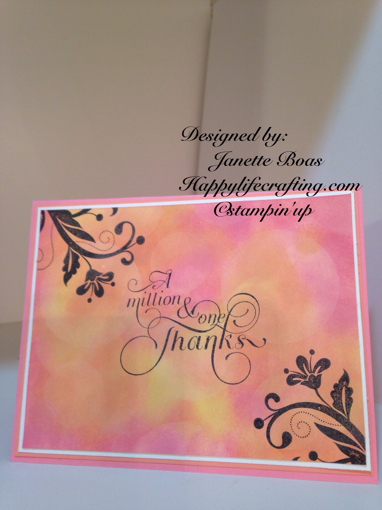
This first picture, is the card we made in one of our Tuesday classes. I’m sharing this one, to show the difference from the one I re vamped, yesterday. If you look closely you will notice that the black, stamped image is dull. This is because the white pigment ink or craft ink I used to soften the colors , and create the bokeh effect, which are the circles, muted the black ink.

In this picture, the black, stamped image is much brighter, the colors are brighter too. I used less craft ink or white pigment ink. The next few photos are my attempt to share with you the steps to make this card or one similar. My future goal is to make quick, video tutorials, but for now this will have to do. I still need to learn how to do a few more things on this blog, to get it dialed in….. Please feel free to contact me for questions .

These are the stamp sets used to make the card above. See online Store for more details.

All the supplies are from Stampin’ up and are available in my online Store.
The cardstock I chose to use are the new in colors. I labeled the colors of the paper in the photo. Except for the tip top taupe, which is the card base. You can see the measurements to cut each layer before starting, as well. 
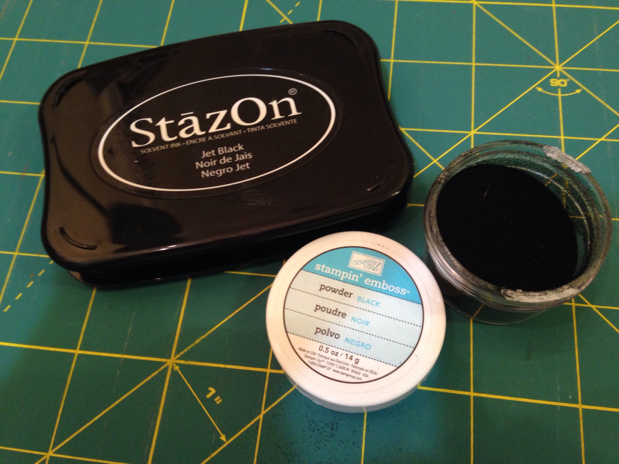
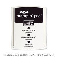
In this picture you can see the ink used to stamp the chosen images. Stamp them on the whisper white card stock (card topper). After stamping the images, heat emboss the images with black embossing powder. This step is what made the images brighter and shiny. The embossing also made the image resistant to absorbing the colored inks and craft ink. You certainly can omit the embossing step, like I did in the first one I made. It just won’t be as bright. As you can see by looking at the two different pictures above.

This next pictures shows the colored inks I used, which match the colors of the card stock. I took the sponge wedges dipped them in each of the colored ink and inked up the whisper white, piece of paper with the images already stamped on. Just randomly smear on the 3 different colors over the black image with the sponges.

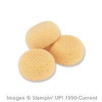
Here, you can see a piece of acetate paper that I punched 3 different size holes in, to make a stencil. Use the stencil to create the circles on top of the colored ink. In this picture you can also see the craft ink, which is white pigmented ink. I used a sponge dauber to lightly sponge the circles. Moving in circular motion and slightly over lapping them; also allowing a couple of the circles to go off the paper. This adds more dimension and character.
Tips: use the craft ink sparingly. Blot it off on scratch paper after dipping into the ink before applying it, to prevent botching.
Refer to picture of completed card to see placement of circles. The craft ink mutes the bright colors creating a fuzzy look and the circles represent the lights ….. This is a version of Bokeh, in card making.

Once you have completed all the steps, you can assemble your card layers.
This is my first written tutorial…I certainly hope it’s understandable.
This is a fun card to make and it moves quickly once you have the steps down…. Practice, practice!
I have several more cards and projects to share….. So stay tuned…..
Knitting is hot on my list of things to do…. I’m on the verge of finishing up a couple projects and will be sharing them….
Hope you have been inspired.
Be happy … And have a happy life crafting!
Janette
Here are the essential supplies to make this card: